13
Jan 2025
- BY Kevin Barry BSc(Hons) MRICS
- POSTED IN Latest News
- WITH 0 COMMENTS
- PERMALINK
- STANDARD POST TYPE
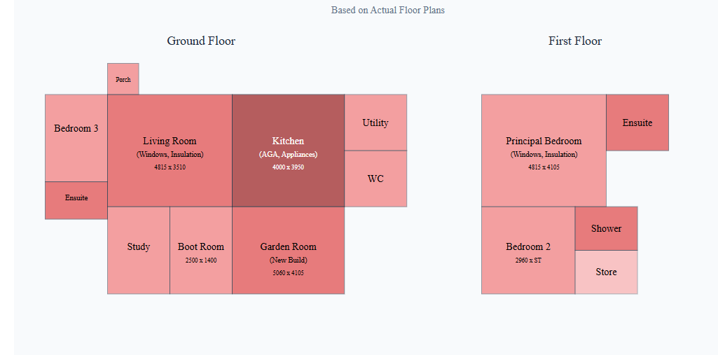
As a new service for clients, the above visual representation of cost tells a story. Below we help explain why a cost heatmap is beneficial for projects; in this example, 3 extensions were being added to an existing building.
- Visual Cost Distribution Understanding
- The heatmap immediately shows where the highest costs are concentrated, with the kitchen (in dark red) being the most expensive area due to the £42,000 allocation for kitchen units, AGA, and appliances
- The garden room extension also shows high cost intensity due to being new construction
- This visual representation makes it easier to understand cost allocation compared to looking at spreadsheets alone
2. Decision Making Support
- Helps identify areas where cost savings might be possible by showing the relative expense of different spaces
- Makes it clear which areas are driving project costs (like the kitchen and bathrooms) versus lower-cost areas like storage spaces
- Can help with phasing decisions if the project needs to be broken into stages based on budget
3. Stakeholder Communication
- Provides an intuitive way to explain costs to clients who may not be familiar with reading traditional cost breakdowns
- Makes it easier to discuss potential value engineering options by focusing on the “hottest” (most expensive) areas
- Helps justify costs by showing the relationship between major works (like window replacements) and their impact on specific rooms
4. Project Planning
- Identifies areas requiring more detailed cost control during construction
- Highlights zones where multiple expensive elements overlap (like where new windows, insulation, and structural work coincide)
- Can help with scheduling by showing where the most complex (and expensive) work is concentrated